
10 Beachside Sunscreen Packaging Designs You’ll Love
Standing in the sunscreen aisle can feel more overwhelming than it should. Every bottle looks the same, the labels are hard to read in a hurry, and half of them look like they belong in a hospital, not a beach bag. If you have ever tossed a sunscreen into your tote just because the design caught your eye, you already know packaging matters more than we like to admit. This list rounds up ten beachside sunscreen packaging styles that actually feel like summer, so you know what to look for the next time you shop.
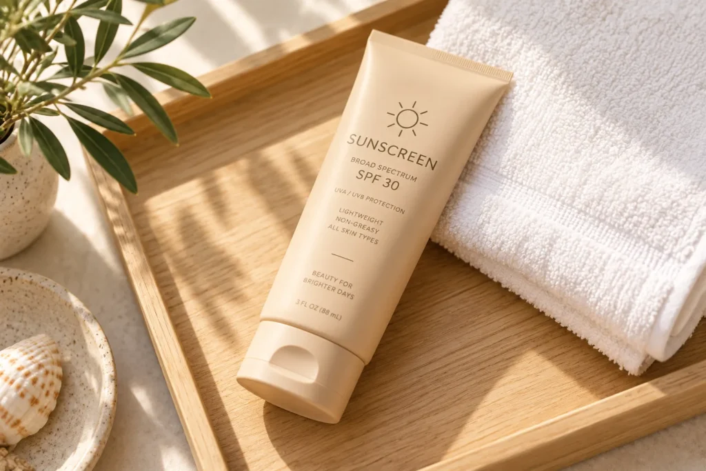
1. Sandy Neutral Tones With a Matte Finish
A sunscreen bottle in warm beige or sand tones with a matte finish feels instantly calming next to a bright beach towel. Matte finishes also hide fingerprints and sunscreen smudges better than glossy plastic, which matters when your hands are already covered in lotion. Brands going for a minimalist, spa-like feel often choose this palette because it photographs well against neutral backgrounds like linen or wood.
This works especially well for travel size bottles that end up sitting on a hotel bathroom counter. A soft sand tone blends into almost any vacation aesthetic instead of clashing with it.
2. Ocean Gradient Bottles
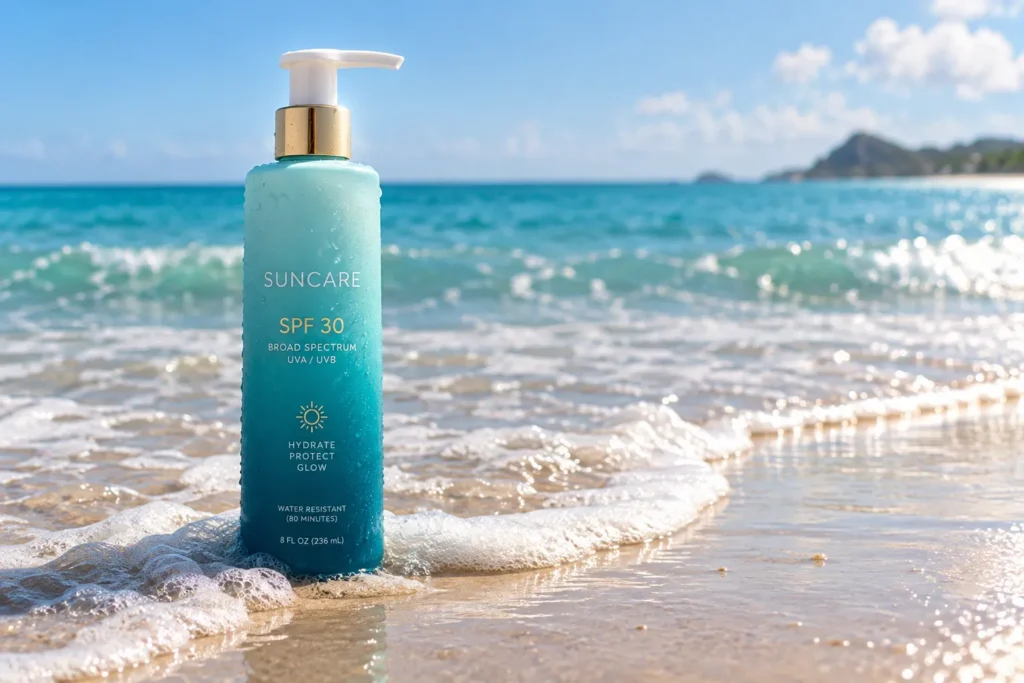
Gradient designs that shift from deep teal at the bottom to a lighter aqua at the top mimic the look of the ocean itself. This style works well on tall pump bottles since the gradient has more room to show its full range. It gives the product a fresh, watery feel even before you open the cap.
A common mistake brands make here is using too many colors in the gradient, which ends up looking busy on a small label. The most effective versions stick to two or three closely related shades so the eye reads it as one smooth wave rather than a rainbow.
3. Clear Bottles With Visible Product
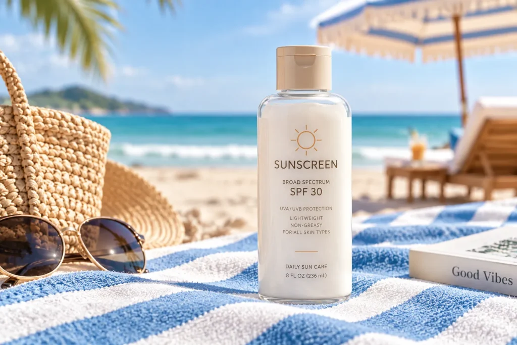
Clear packaging that lets you see the actual lotion inside has become popular for brands that want to highlight a lightweight or non greasy formula. Seeing a white or slightly tinted cream through clear plastic builds trust before the customer even reads the label, because it feels honest about texture.
This design choice works best for gel based or fast absorbing sunscreens, since a thick white cream in a clear bottle can look heavy or old fashioned by comparison. If your formula is light and silky, clear packaging is one of the simplest ways to show that off without extra text.
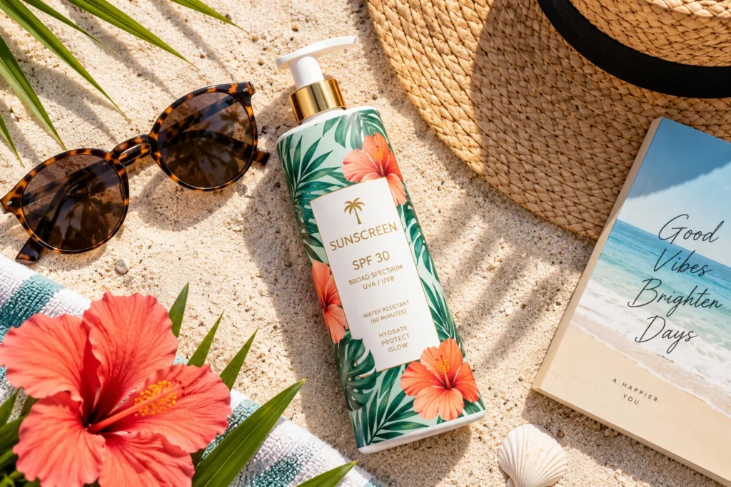
4. Bold Tropical Print Labels
Labels covered in palm leaves, hibiscus flowers, or bright citrus patterns turn a plain bottle into something that looks fun to pack. These prints tend to do very well on Pinterest because they photograph beautifully in flat lay shots next to sunglasses and flip flops.
One thing to watch for with tropical prints is legibility. If the pattern is too busy, the SPF number and brand name can get lost. The strongest designs use a solid color block behind the text so key information still stands out clearly against the pattern.
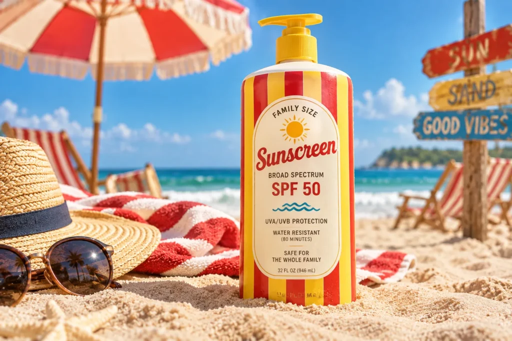
5. Retro Stripe Packaging
Vintage inspired stripes in red, yellow, and white bring a nostalgic beach club feeling that many brands are leaning into right now. This style works particularly well for family sized bottles meant to sit on a towel all day, since the bold stripes are easy to spot from a distance in a crowded beach bag.
Retro packaging also tends to skip trendy fonts in favor of simple, rounded lettering, which keeps the whole look feeling timeless instead of tied to one passing trend.
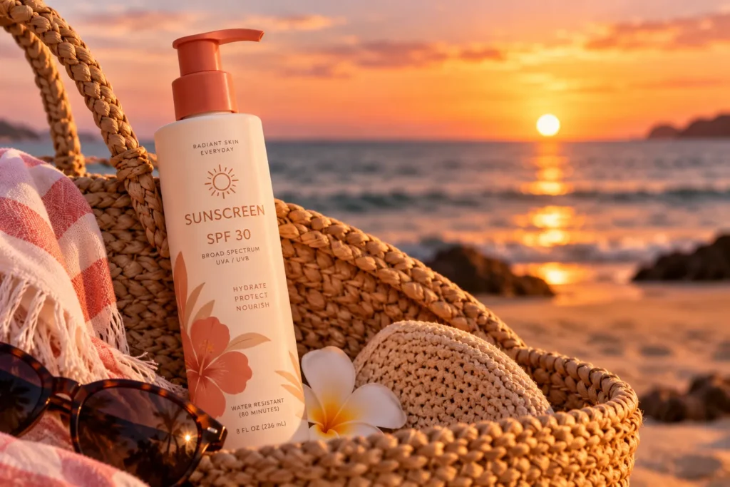
6. Coral and Terracotta Accents
Warm coral or terracotta tones paired with cream colored bottles give off a sun soaked, earthy feel that fits well with a natural or clean beauty positioning. This color pairing works because it echoes actual sunset and skin tones rather than the cool blues most sunscreen brands default to.
A helpful detail here is that terracotta and coral photograph beautifully in golden hour lighting, which is exactly when most beach content gets shot. If your target customer is someone who cares about how products look in their photos, this palette gives them an easy win.
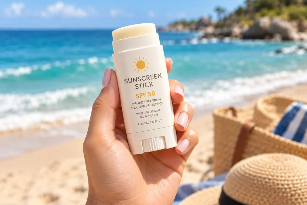
7. Compact Stick Applicators
Sunscreen sticks in slim, twist up packaging have grown popular for face and reapplication use, especially for people who do not want to touch sunscreen with wet or sandy hands. The packaging itself often mimics a deodorant stick, which makes it instantly familiar to use even for first time buyers.
This format shines for parents managing sunscreen on kids at the beach, since a stick is faster to reapply than rubbing in lotion with your fingers. Brands that lean into this convenience angle often print reapplication reminders right on the stick itself.
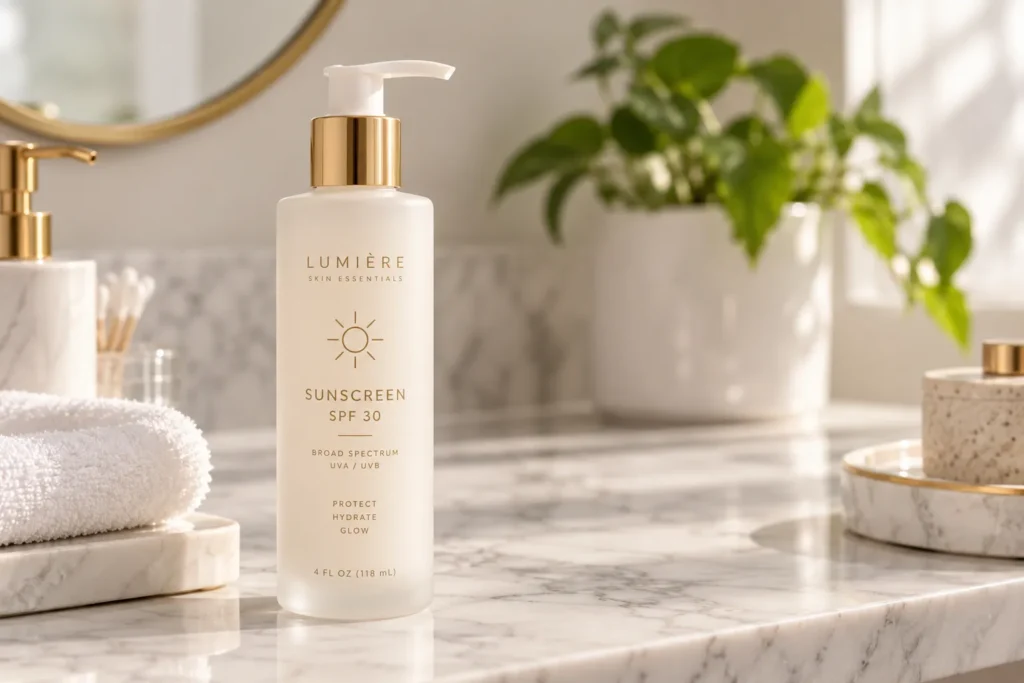
8. Frosted Glass Look Bottles
Frosted plastic bottles designed to mimic glass give sunscreen a more elevated, skincare shelf feel rather than a drugstore one. This works especially well for higher end mineral sunscreens, since the frosted texture pairs naturally with simple black or gold text.
One common mistake is pairing a frosted bottle with a busy label, which cancels out the clean look you were going for. The most successful frosted designs keep the label small and centered, letting the texture of the bottle do most of the visual work.
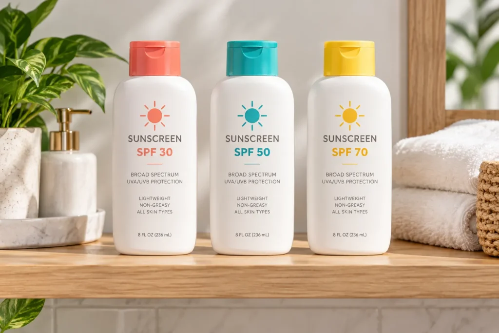
9. Two Tone Cap and Body Combos
Pairing a bright cap color with a neutral bottle body is a simple way to make a product stand out on a shelf without a full redesign. A coral cap on a white bottle, for example, gives just enough color pop to catch the eye while keeping the overall look clean.
This approach is especially useful for brands with a full sunscreen line, since different cap colors can quickly signal different SPF levels or formulas without needing separate label designs for each one.
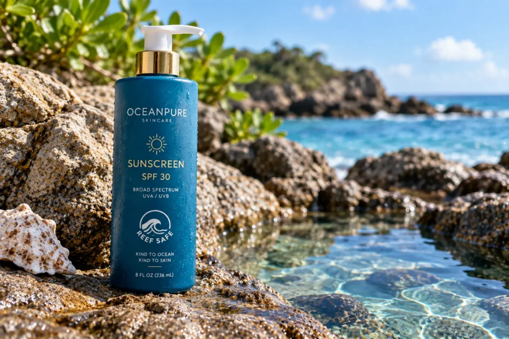
10. Reef Safe Badging With Ocean Blue Packaging
As more shoppers look for reef safe formulas, packaging that clearly highlights this in deep ocean blue tones with a small badge or icon has become a strong trust signal. The blue tone visually reinforces the ocean safe message before the customer reads a single word.
The key here is keeping the reef safe badge simple, usually just a small wave icon or a short phrase like reef friendly, rather than covering the bottle in text. Overloading the label with claims can actually make a product feel less trustworthy, not more.
Packaging will never replace a good formula, but it is often what gets a sunscreen into your bag in the first place. Whether you are drawn to sandy neutrals or bold tropical prints, the best beach sunscreen packaging makes reapplying feel less like a chore and more like part of the fun. Next time you are shopping for SPF, take a second look at the bottle itself. Save this list so you have some favorites in mind before your next beach trip.
Image Alt Text Suggestions
- Matte sand colored sunscreen tube on wood tray with white towel
- Teal to aqua gradient sunscreen bottle on wet beach sand
- Clear sunscreen bottle showing white lotion on striped blanket
- Tropical print sunscreen bottle flat lay with sunglasses and hat
- Red and yellow striped family size sunscreen bottle in sand
- Cream sunscreen bottle with coral cap on woven basket at sunset
- Hand holding twist up sunscreen stick at the beach
- Frosted white sunscreen bottle with gold text on marble counter
- Row of white sunscreen bottles with different colored caps
- Deep blue reef safe sunscreen bottle near a tide pool
FAQ Section
Does sunscreen packaging affect how well it protects your skin?
No, packaging design does not change SPF effectiveness. It can affect how well the product is protected from air and light exposure, which matters more for preserving the formula over time.
Why do some sunscreens come in tubes and others in pump bottles?
Tubes are often used for smaller or travel size products since they are easy to pack and control the amount dispensed. Pump bottles work well for larger everyday sizes because they make it faster to apply generous amounts.
Are reef safe sunscreens usually labeled differently?
Many reef safe sunscreens use blue tones and a small badge or icon to highlight this feature clearly. This makes it easier for shoppers to spot ocean friendly options quickly while browsing.
What packaging is best for keeping sand out of the cap?
Twist up sticks and snap cap tubes tend to keep sand out better than open pump tops. Flip top caps with a tight seal are also a solid choice for beach use.
Does clear packaging mean the sunscreen is more natural?
Not necessarily. Clear packaging usually just highlights the texture or lightness of the formula rather than indicating natural ingredients. Always check the ingredient list for that information.
Why do family size sunscreens often use bold, bright designs?
Bold designs make the bottle easier to spot in a crowded beach bag or on a towel. Bright colors and stripes also tend to feel more fun and approachable for family use.


