
10 Sun Protection Lotion Ad Ideas That Actually Convert
Ever scroll past a dozen sunscreen ads in a row and forget every single one of them by the time you close the app? You are not alone. Most sun protection lotion ads look the same, feel the same, and say nothing new. If you are trying to promote your own sunscreen, or you just need fresh inspiration for a campaign, this list will give you ten ideas that actually catch attention and stick.
1. The Golden Hour Application Shot
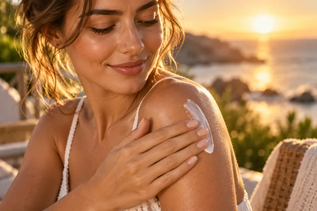
Nothing sells sun protection like watching someone actually put it on in warm, natural light. Skip the harsh studio lighting and film or photograph the lotion being smoothed onto shoulders or a face right as the sun is low in the sky. The glow makes the product feel indulgent instead of clinical.
A common mistake here is over editing the photo until the skin looks unnaturally airbrushed. Keep some texture visible. It reads as more honest, and honest sells better than perfect.
This style works especially well for beach vacation promotions or summer launch campaigns where the mood matters as much as the product.
2. Before and After Sun Damage Comparison
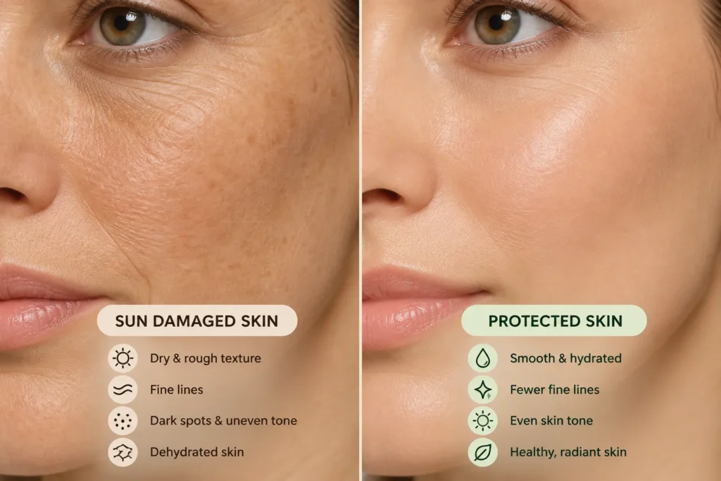
People respond to visual proof. A side by side comparison showing skin protected daily versus skin exposed without protection over time can be a powerful hook, especially for an audience that already worries about premature aging.
The key is to keep the comparison realistic. Avoid dramatic before and after edits that feel staged or exaggerated, since that instantly breaks trust with a skincare audience who has seen plenty of fake transformation photos already.
Pair this idea with a short caption explaining what UV damage actually does to collagen over time. That small educational detail gives the ad more weight than a plain product photo ever could.
3. The “What’s Actually In It” Ingredient Breakdown
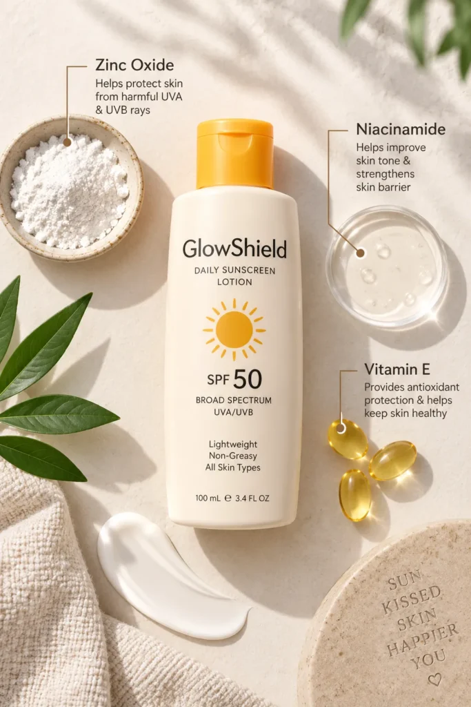
Many buyers now flip the bottle before they buy anything, so an ad built around ingredients speaks directly to that habit. Highlight one or two standout ingredients, like zinc oxide or niacinamide, and explain in plain language what each one does for the skin.
This works best as a simple flat lay graphic with the bottle in the center and small labeled call outs pointing to key ingredients. It feels informative rather than salesy, which tends to earn more saves on Pinterest than a straightforward product shot.
Most people overlook how much trust a clear ingredient explanation builds. A confusing label pushes buyers away even when the product itself is good.
4. Everyday Routine Integration
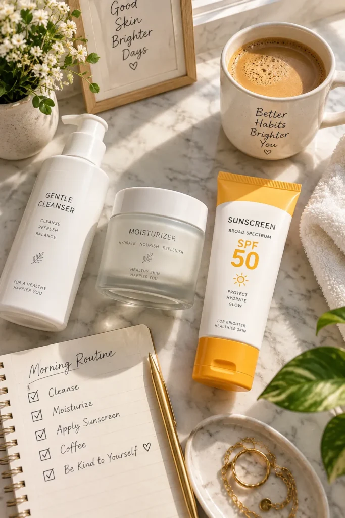
Show the lotion as part of a normal morning, not a special occasion. A quick clip or photo series of someone applying it right after moisturizer, then grabbing coffee and heading out the door, tells the viewer this is a habit they can realistically stick to.
The emotional pull here is simplicity. A lot of people skip sunscreen because it feels like one more step in an already long routine. An ad that shows it fitting seamlessly into three or four steps removes that mental barrier.
This idea performs particularly well for busy professionals or parents who need convincing that sun protection does not have to be complicated.
5. The Texture Close Up
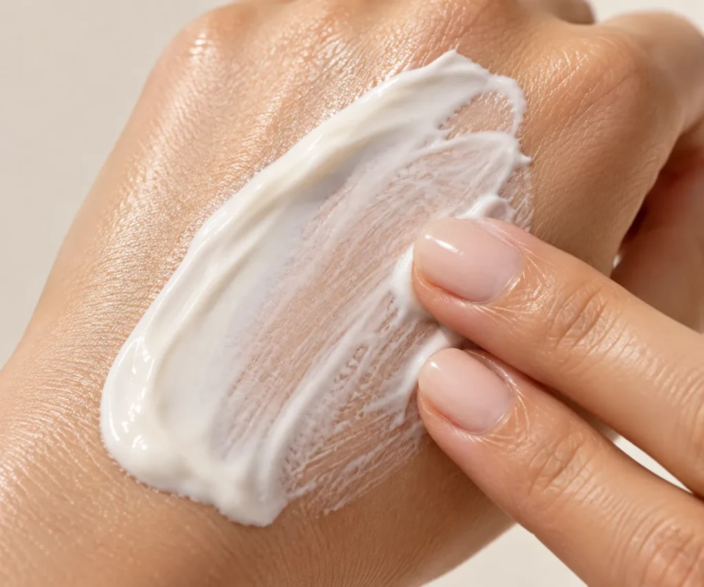
Texture sells more than people realize. A close up shot or short clip of the lotion being swiped across the back of a hand, showing how it blends in without leaving a white cast, answers one of the biggest hesitations buyers have before purchasing.
If the formula is lightweight or blends clear, make that the entire focus of the ad. If it has a slight tint or dewy finish, show that honestly too. Overpromising a texture the product does not deliver leads to returns and bad reviews, which hurts far more than a slower sales start.
6. Weather and Season Specific Messaging
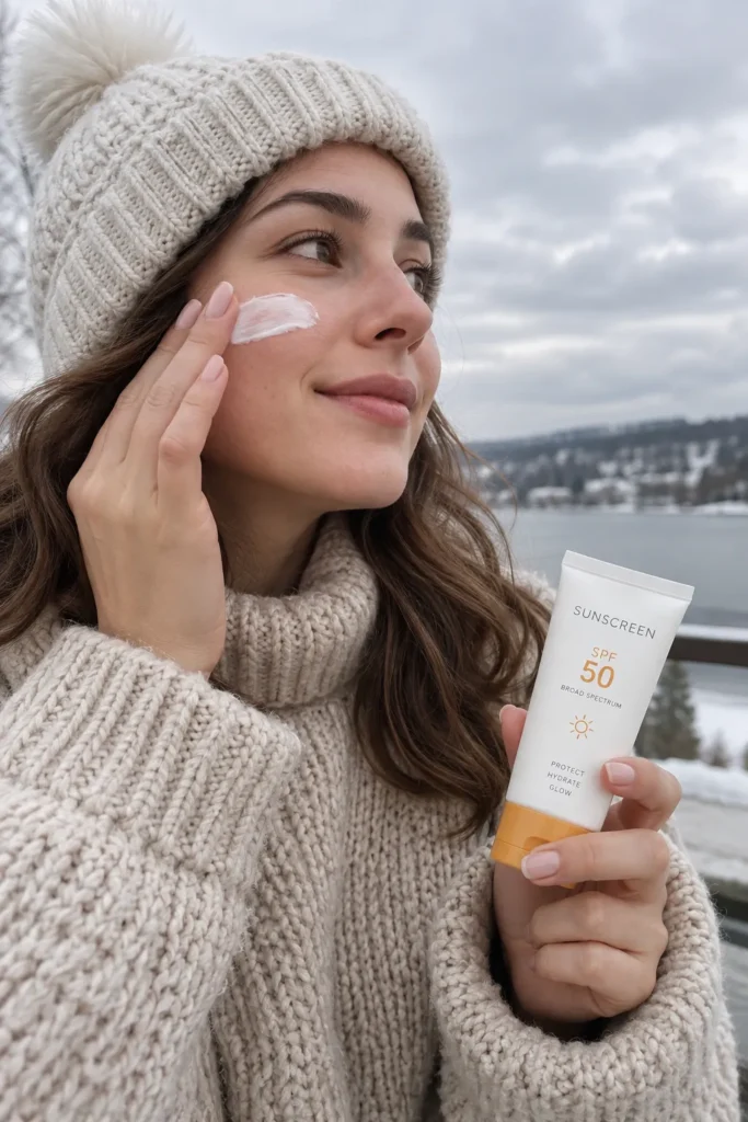
Sun protection is not just a summer conversation anymore, and ads that acknowledge this tend to stand out. Try a concept built around cloudy day protection, winter sun exposure during skiing, or year round use for daily commutes.
This angle works because it corrects a common misunderstanding. Plenty of people assume they only need sunscreen when it is sunny and hot outside, and that mistake leads to unnecessary sun damage the rest of the year. An ad that gently points this out while offering the fix positions the brand as genuinely helpful rather than just trying to make a sale.
7. User Generated Style Testimonial
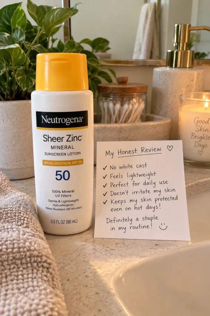
A raw, slightly imperfect looking testimonial photo or video often outperforms a polished ad. Feature a real sounding review, even if it is written in a simple style, alongside a casual photo of the product in someone’s bathroom or bag.
This format earns trust because it does not look like traditional advertising. It looks like a friend sharing something that worked for them, which fits naturally into a Pinterest feed full of personal recommendations.
Consider rotating a few of these throughout a campaign so the messaging feels varied instead of repetitive.
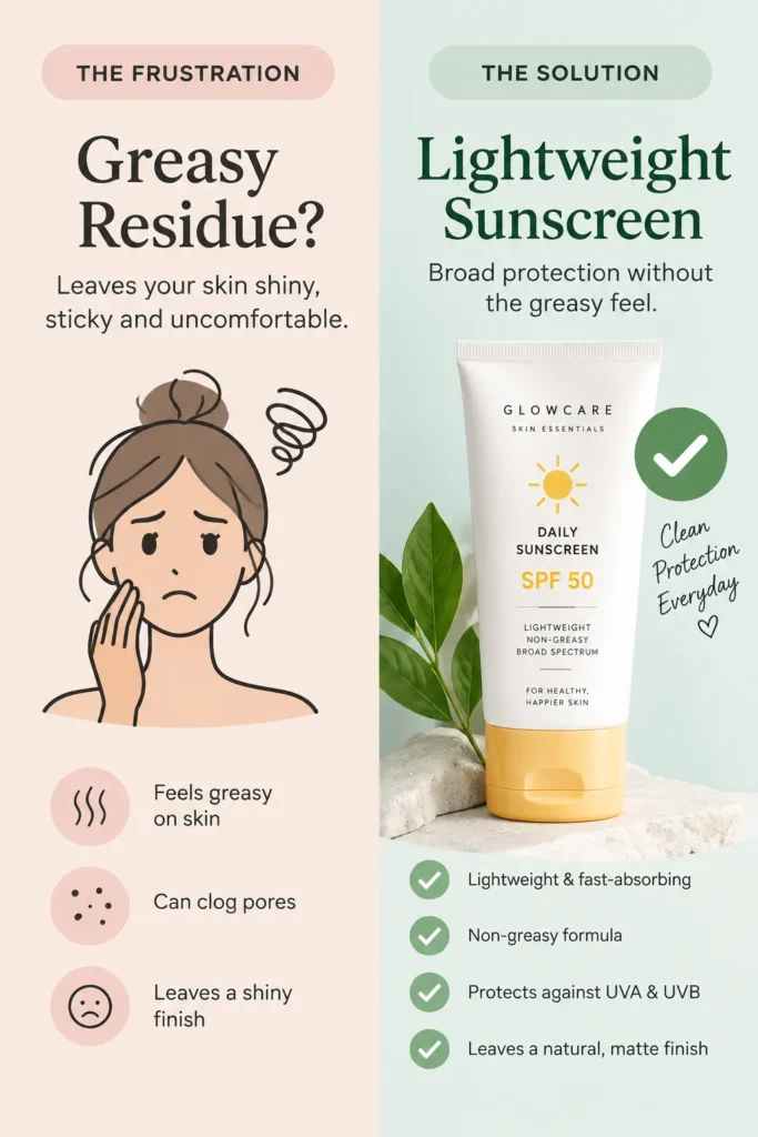
8. The Problem and Solution Split Graphic
Lay out a common frustration, like sunscreen feeling greasy or causing breakouts, directly next to how the featured lotion solves it. This format is easy to scan quickly, which matters since most people decide whether to stop scrolling within a second or two.
Keep the wording short on both sides. One line for the problem, one line for the solution, is usually enough. Overloading this graphic with text is one of the fastest ways to lose the reader before they even reach the product name.
You will likely want to save this format for multiple products, since it adapts easily to different pain points like fragrance sensitivity or oily skin.
9. Family or Group Lifestyle Scene
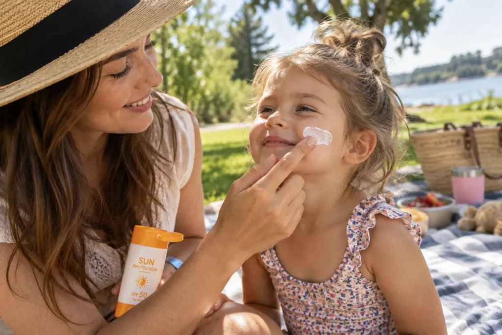
Show the product being used in a shared moment, like a parent applying it to a child before a park visit, or friends passing the bottle around at the beach. This taps into a different motivation than personal skincare, since protecting loved ones often carries more emotional weight than protecting yourself.
Keep the scene candid rather than posed. A slightly messy, real looking moment, like sand on a towel or a half eaten snack nearby, makes the ad feel like a genuine memory instead of a staged advertisement.
10. The Myth Busting Carousel
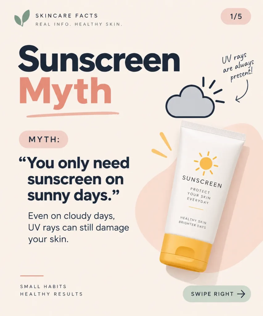
Create a short multi slide graphic that debunks one sun protection myth per slide, such as darker skin tones not needing sunscreen, or a higher SPF number always meaning better protection. End the final slide with the product as the practical takeaway.
This format naturally encourages saves, since people often want to return to reference the information later rather than read it once and move on. It also positions the brand as a source of real knowledge, not just another company trying to sell a bottle.
Be careful not to overstate any claim during the myth busting portion. Stick to information that is widely accepted and easy to verify, since one shaky claim can undo the credibility the rest of the carousel builds.
Sunscreen ads do not have to feel repetitive or forgettable, even in a crowded space. The ideas that work best are usually the ones that feel honest, specific, and a little bit personal, rather than polished for the sake of looking polished. Pick one or two of these concepts to try in your next campaign instead of attempting all ten at once. Small, focused changes tend to show results faster than a complete overhaul. Give one of these a real try this week and see which angle your audience responds to most.
Image Alt Text Suggestions
- Woman applying sunscreen to her shoulder in warm golden hour light
- Split screen comparison of sun damaged skin versus protected skin
- Flat lay of sunscreen bottle with key ingredients labeled
- Morning skincare routine including sunscreen as a daily step
- Close up of sunscreen texture blending into skin
- Person applying sunscreen during a cold overcast day
- Sunscreen bottle displayed with a casual handwritten review
- Problem and solution graphic comparing sunscreen frustrations to fixes
- Parent applying sunscreen to child at the park or beach
- Myth busting carousel slide about sun protection facts
FAQ Section
What makes a sunscreen ad actually effective?
An effective sunscreen ad usually solves a specific problem, like white cast or greasy texture, instead of just showing the product. Honest visuals and clear benefits tend to perform better than overly polished, generic shots.
Should sunscreen ads only run in summer?
No, sun exposure happens year round, so ads that highlight cloudy day or winter protection often stand out more since they correct a common misconception.
What type of photo works best for a sunscreen ad on Pinterest?
Natural lighting, real skin texture, and everyday settings tend to outperform overly staged studio photos, since they feel more relatable to someone scrolling for genuine recommendations.
How can I make a sunscreen ad feel trustworthy?
Focus on specific details like ingredients, texture, or a realistic testimonial rather than vague claims. Small, honest details build more trust than dramatic promises.
Do ingredient focused ads actually help sell sunscreen?
Yes, many buyers check ingredient lists before purchasing, so an ad that explains a key ingredient in simple terms can address hesitation before it even comes up.
Is user generated content better than professional photography for sunscreen ads?
It depends on the goal. Polished photography works well for brand awareness, while casual, testimonial style content often earns more trust and engagement for driving actual purchases.
Want this as a Word doc or ready to paste into your CMS as Markdown? I can put it into a file for you.


