
10 Vacation Sunscreen Branding Ideas That Stand Out
Summer shelves are packed with sunscreen bottles that all start to look the same. White cap, beach photo, a wave of blue somewhere on the label. If you have ever tried to make a sunscreen brand feel different from the ten others sitting next to it, you know how frustrating that sameness can be. Customers scroll past in seconds, and a forgettable bottle means a forgettable sale. This list breaks down ten branding ideas that help vacation sunscreen products actually get noticed, remembered, and picked up off the shelf or the screen.
1. Build the Bottle Around a Specific Trip, Not a Generic Beach
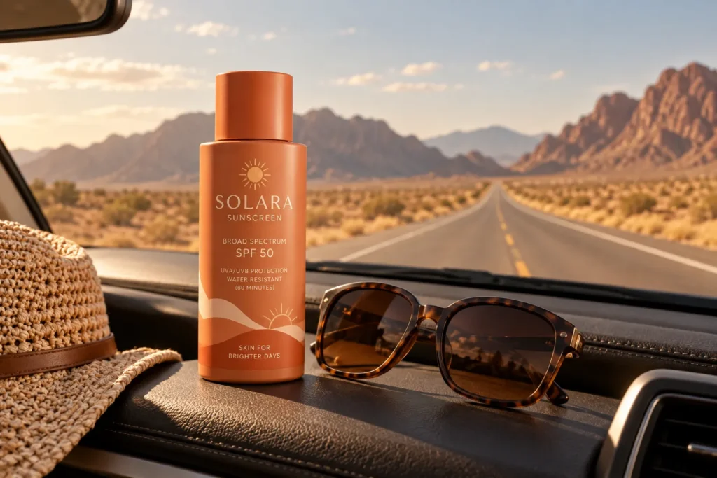
Most sunscreen branding leans on the same beach vacation cliche. Instead, tie the product to one specific kind of trip, like a road trip through desert towns, a lake house weekend, or a tropical island escape. This gives the copywriting, colors, and imagery a clear direction instead of trying to be everything to everyone.
For example, a brand aimed at road trip travelers could use dusty orange and warm terracotta tones with copy about protecting skin through long hours in the car with the windows down. A brand aimed at island travelers could lean into deep turquoise and glossy finishes. Picking one trip type makes the whole line feel intentional instead of copied from a template.
2. Use a Signature Color That Has Nothing to Do With Blue or Orange
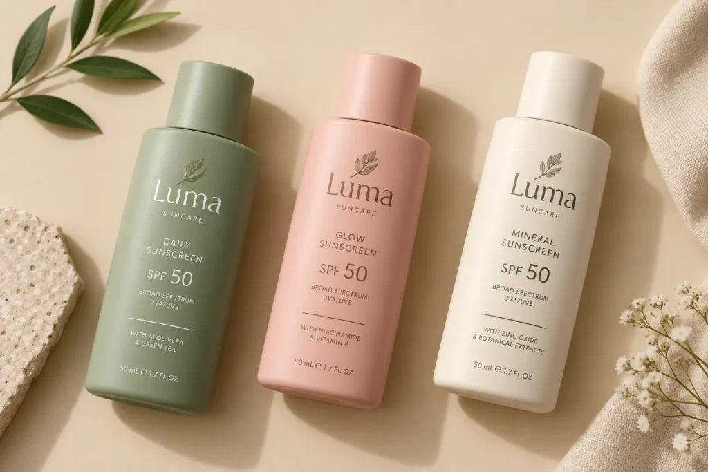
Nearly every sunscreen brand defaults to ocean blue or sunset orange. A signature color outside that expected range, like a soft terracotta, a muted sage green, or a warm blush, makes a product instantly recognizable in a sea of sameness.
The mistake many small brands make is choosing a color because it looks pretty on a moodboard, then never using it consistently. The fix is picking one main color and repeating it everywhere, the cap, the pump, the shipping box, even the social media graphics. Repetition is what builds recognition over time, not a single pretty photo.
3. Design the Label to Work as a Photo Prop, Not Just Packaging
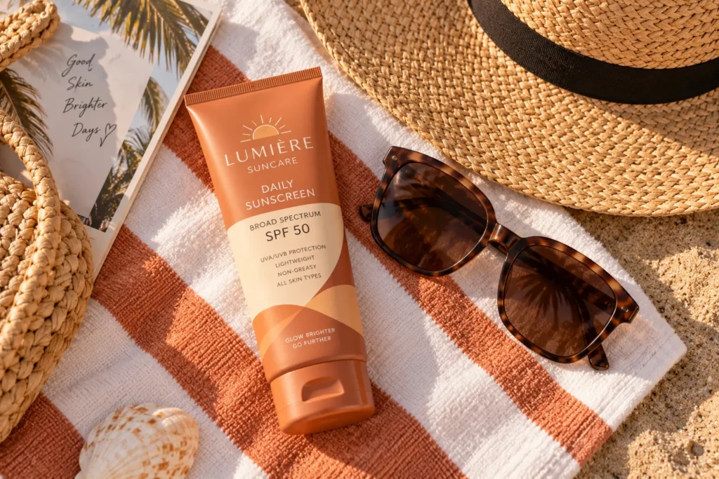
Pinterest and Instagram users often photograph their vacation products as part of their trip content. A label designed with this in mind, using clean typography and a pattern that photographs well in natural light, turns every customer into free advertising.
A brand can test this by laying the bottle on a towel, next to sunglasses, or on a hotel balcony ledge and checking how it looks in a real photo, not just a studio shot. If the label gets lost in the background or looks cluttered in a casual photo, it needs simplifying. This is one of those save worthy details that separates a forgettable product from one people actually want to show off.
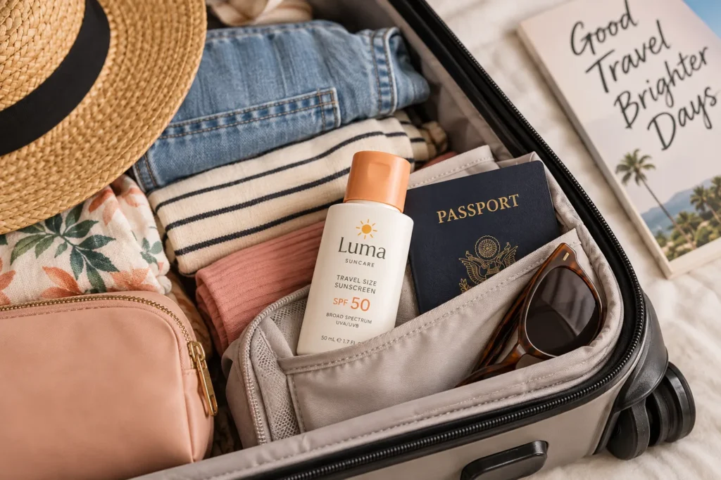
4. Create a Mini Travel Size With Its Own Personality
A travel size version should not just be a smaller copy of the full size bottle. Giving it its own name, like a “Jet Set Mini” or “Carry On Size,” and a slightly different design detail, like a different cap color, makes it feel like a thoughtful product rather than an afterthought.
This works especially well for brands targeting frequent flyers or minimalist packers who care about fitting everything into a small bag. A common mistake is shrinking the label so much that it becomes unreadable. The fix is redesigning the layout specifically for the smaller surface instead of just scaling it down.
5. Lean Into a Scent Story in the Branding Copy
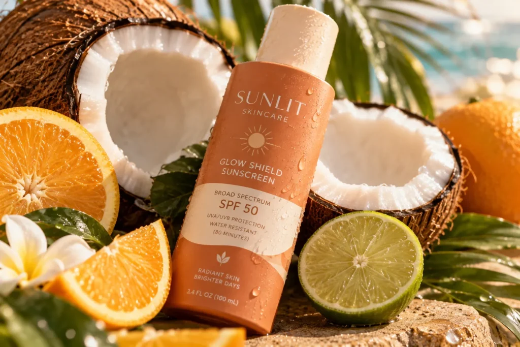
Sunscreen scent is one of the most emotional parts of the vacation experience. Many people associate a certain coconut or citrus smell with childhood beach trips. Branding copy that tells a specific scent story, like describing the exact moment the scent brings someone back to a memory, connects emotionally in a way that ingredient lists never will.
Instead of writing “smells like coconut,” a stronger version might describe the scent as the one that turns an ordinary afternoon into something that feels like vacation. This kind of writing gives the product a personality instead of just listing a feature.
6. Use Real Skin Tones and Textures in Every Visual
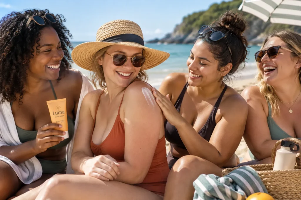
One of the most common branding mistakes in this space is showing only one skin tone or one body type in campaign photos. This narrows who feels invited to buy the product. Featuring a range of skin tones, ages, and body types in campaign imagery widens the audience and builds real trust.
This matters even more for sunscreen since different skin tones have different needs and concerns around sun protection. A brand that shows this range in its photography signals that the product was actually made with everyone in mind, not just one type of customer.
7. Package the Bottle to Survive a Beach Bag, Not Just a Bathroom Shelf
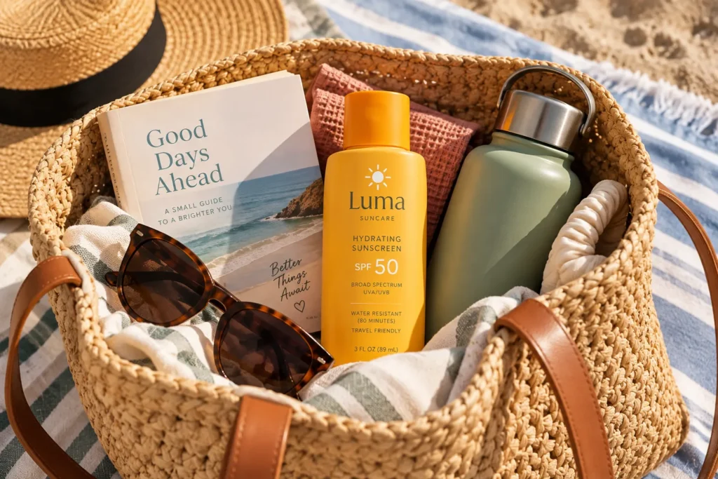
Vacation sunscreen gets thrown into beach bags, sat on by towels, and left in hot cars. Branding that acknowledges this reality, with a sturdier cap, a non slip grip texture, or a bright color that is easy to spot at the bottom of a bag, solves a real problem instead of just looking nice.
A brand can highlight this directly in its copy, mentioning that the bottle was designed to survive real vacation chaos, not just a photo shoot. This is the kind of practical detail that builds trust because it shows the brand actually thought about how the product gets used.
8. Create a Limited Summer Only Design Refresh
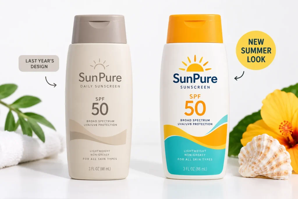
A limited edition label refresh each summer gives returning customers a reason to pay attention again instead of assuming the product looks the same as last year. This can be as simple as a seasonal color swap or a small pattern change on the cap.
The key is announcing it clearly across social media and email so people know to look for the new design. Skipping this step is a common mistake, since a beautiful redesign does nothing if customers never hear about it. Pairing the launch with a short countdown or preview builds anticipation before the product even hits shelves.
9. Write Ingredient Callouts in Plain Language, Not Just Lab Terms
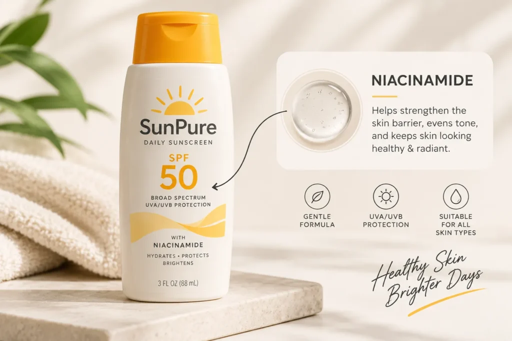
Many sunscreen labels lean heavily on technical language like broad spectrum or zinc oxide percentages without explaining what any of it means for the person holding the bottle. Translating this into plain, friendly language builds trust with someone who is not a skincare expert but still wants to make a smart choice.
Instead of just listing “non-nano zinc oxide,” a brand could explain that this form of zinc sits on top of the skin instead of soaking in, which is why it works well for sensitive skin on vacation. This kind of explanation, not just a listed fact, is what builds real credibility.
10. Build a Small Vacation Ritual Around the Product
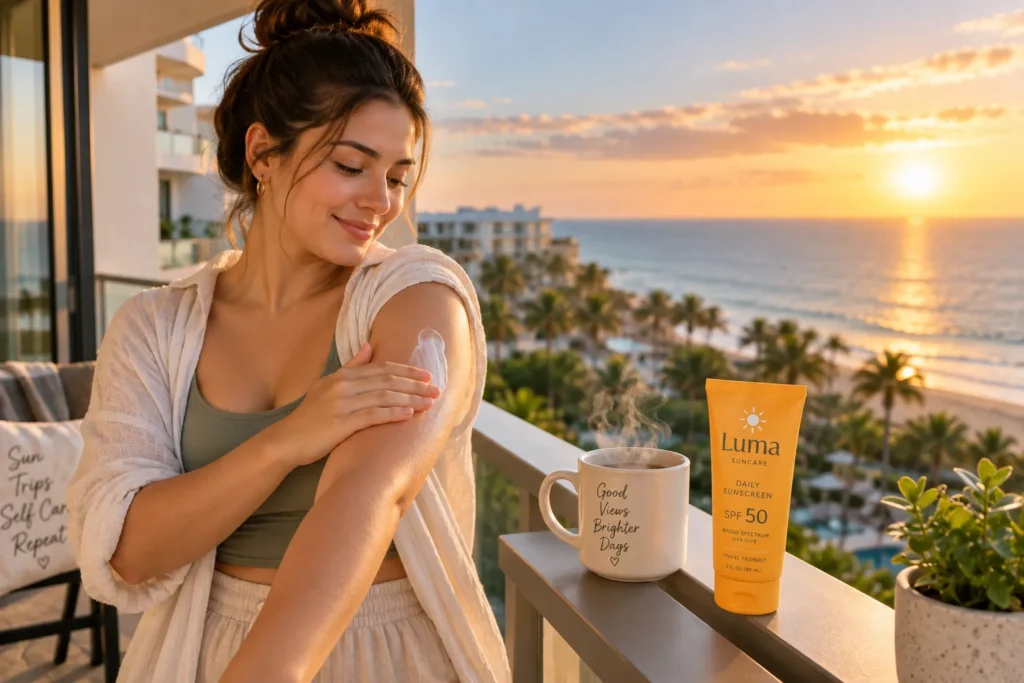
Branding that turns sunscreen application into a small ritual, rather than a chore, creates a stronger emotional connection. This could be suggested through copy about a specific order of application, a pairing with an after sun product, or a suggestion to apply it while watching the sunrise before a beach day.
A brand can build an entire content series around this idea, showing the ritual step by step across social media. People are far more likely to return to a product that feels like part of their vacation routine instead of just another item on a packing list. [INTERNAL LINK OPPORTUNITY: after sun skin care routine ideas]
Building a vacation sunscreen brand that actually stands out does not require a huge budget or a complicated rebrand. It comes down to consistent choices, from color to copy to how the bottle survives a real beach bag. If your current branding feels like it blends in with everyone else on the shelf, pick just one idea from this list and try it before your next summer launch. Small, intentional changes add up faster than most people expect. [INTERNAL LINK OPPORTUNITY: sunscreen packaging design ideas]
Image Alt Text Suggestions
- Sunscreen bottle on car dashboard with desert road visible through windshield
- Three sunscreen bottles in sage green and blush color palette on neutral background
- Sunscreen bottle on striped beach towel next to sunglasses and straw hat
- Small travel size sunscreen bottle next to packed carry on suitcase
- Close up of sunscreen bottle with coconut and citrus fruit styling
- Group of people with different skin tones applying sunscreen on the beach
- Sunscreen bottle inside open beach bag with sunglasses, book, and water bottle
- Two sunscreen bottle designs side by side showing seasonal design refresh
- Sunscreen bottle with simple ingredient callout graphic overlay
- Person applying sunscreen on hotel balcony during golden hour with coffee nearby
FAQ Section
What makes vacation sunscreen branding different from regular sunscreen branding?
Vacation focused branding leans into travel moments, like packing, beach days, or a specific trip type, rather than general daily skin care. It often uses more playful colors and copy tied to specific experiences instead of clinical skin benefits alone.
Do small skincare brands need a big budget to rebrand their sunscreen packaging?
No. A signature color, updated copy, and a more thoughtful label layout can make a noticeable difference without a full packaging redesign. Starting with one or two changes is often more effective than trying to overhaul everything at once.
How important is scent in sunscreen branding?
Scent plays a bigger emotional role than many brands realize, since it often triggers strong vacation memories. Writing copy that describes the feeling a scent brings rather than just naming it can make branding feel more personal.
Should sunscreen branding photos always show a beach?
Not necessarily. Tying the branding to a specific type of trip, like a road trip or a mountain getaway, can help a brand stand out more than another generic beach photo.
Why does representation matter in sunscreen marketing photos?
Showing a range of skin tones and body types signals that the product was made with a wide range of customers in mind, which builds trust and widens the audience who feels invited to try the product.
How often should a sunscreen brand refresh its packaging design?
A yearly seasonal refresh is common and gives returning customers something new to notice, but it works best when paired with a clear announcement so customers actually know to look for the change.


