
10 Sunscreen Ads Design Ideas That Grab Attention
Scrolling past ad after ad without a single one making you stop is a familiar feeling. Sunscreen especially gets lost in the noise because so many bottles look the same and so many ads repeat the same tired lines about protection. If you are trying to market a sunscreen product, or you just love collecting beauty ad inspiration for your own Pinterest boards, that sameness is the real problem. This list breaks down sunscreen ads design ideas that actually pull people in, from color choices to the small details that build trust in seconds.
1. Use Before and After Skin Texture Close Ups
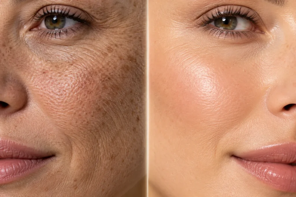
A close up shot of skin texture, one side showing sun damage and the other showing smooth, protected skin, tells a story faster than any headline. This works because people respond to visual proof, not just claims. For a drugstore sunscreen brand, this kind of ad can run on Instagram carousels with a simple swipe reveal. The mistake many brands make is using stock photos that look too polished to be real. Keep the texture slightly imperfect so it feels honest.
2. Build the Ad Around a Single Bold Color
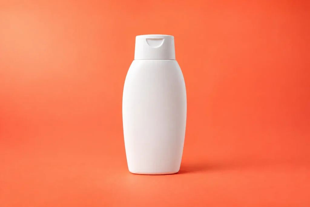
Sunscreen ads often default to soft yellows and beach tones, which makes them blend together. Choosing one unexpected bold color, like a deep coral or a bright cobalt blue, makes the ad instantly recognizable in a crowded feed. A travel focused SPF brand could use this approach with a plain colored background and the product as the only object in frame. The goal is visual memory. When someone sees that same color again next week, they should think of your product before they even read the text.
3. Show the Product Being Used, Not Just Held
An ad that shows a hand actually applying sunscreen to a shoulder or the back of a neck feels more useful than one that just shows a bottle sitting on a towel. This matters because sunscreen is a product people often apply wrong, missing spots or using too little. A mineral sunscreen brand can use this idea to sneak in an application tip inside the ad itself, like showing the right amount for the face. Viewers remember demonstration over description almost every time.

4. Lean Into Humor Instead of Fear
Most sunscreen marketing leans on fear, warning about wrinkles, sunburn, or skin cancer risk. That approach is not wrong, but it gets exhausting when every ad uses it. A lighter, funnier angle, like a cartoon sun wearing sunglasses looking annoyed that it cannot get through your SPF, gives the brand personality. This works especially well for a younger audience shopping for their first proper sunscreen routine. Save this style for social ads rather than search ads, since humor performs better where people are scrolling for entertainment.

5. Use Real Customer Skin, Not Models Only
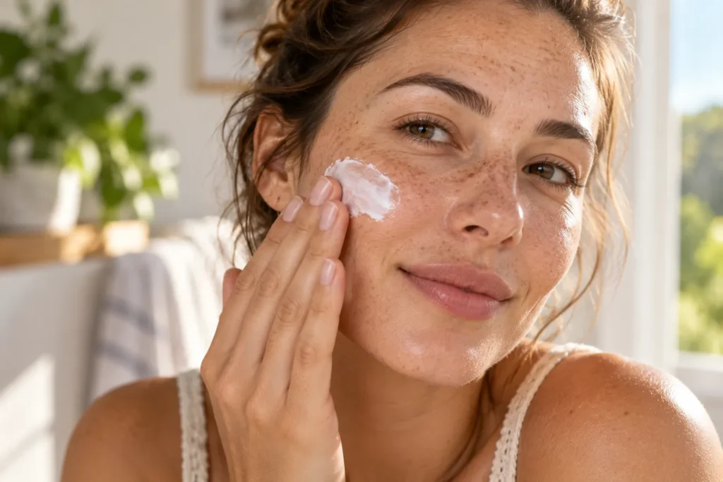
There is a noticeable gap between polished model skin and the skin most buyers actually have. An ad that features a real customer photo, freckles, texture, uneven tone and all, next to a short honest quote about the product feels far more believable. A small independent sunscreen brand can build an entire ad series around this idea using submitted customer photos. The common mistake here is over editing the photo until it looks fake again, which cancels out the whole point of using a real person.
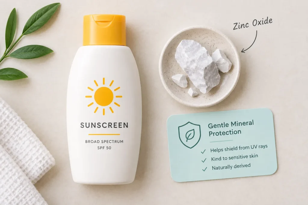
6. Highlight the Ingredient List as the Hero
Instead of hiding the ingredient list in small print, some of the strongest sunscreen ads now put a single standout ingredient front and center, like zinc oxide or niacinamide, with a short line about what it does. This works because skin care buyers today read labels closely and want to understand what they are putting on their face. A sensitive skin sunscreen brand can use this format to build trust quickly without needing a long paragraph of copy. Keep the explanation to one sentence so it stays scannable.
7. Design Around a Specific Moment, Not a General Lifestyle
Generic beach and pool images are everywhere, which makes them easy to scroll past. Designing an ad around one very specific moment, like reapplying sunscreen at a kid’s soccer game or during a lunchtime walk, feels more relatable and less like a stock photo shoot. A family focused sunscreen brand can build several ads this way, each targeting a different daily scenario. The specificity is what makes someone stop and think, that is exactly my life.

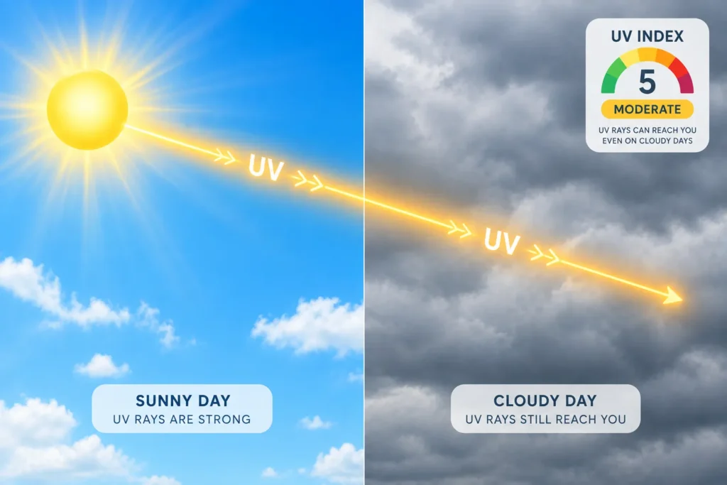
8. Use Split Screen Weather Comparisons
A split screen showing sunny weather on one side and cloudy weather on the other, with a line reminding people that UV rays pass through clouds, teaches something useful while promoting the product. This design idea solves a real misconception that keeps people from wearing sunscreen daily. A daily wear SPF moisturizer brand benefits most from this angle since it directly answers the objection of I only need this at the beach. Pair it with a simple UV index graphic for extra credibility.
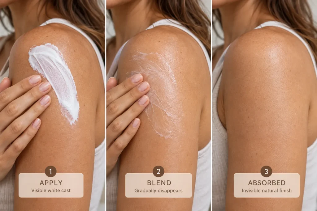
9. Feature Texture and Finish in Motion
Static product shots cannot show how a sunscreen actually feels or finishes on skin, which is often the deciding factor for a repeat buyer. A short looping clip or a sequence of stills showing the product blending in, from white cast to invisible finish, answers the question most shoppers actually have before they buy. This idea works especially well for a tinted mineral sunscreen where the finish is a major selling point. Skip the heavy filter here, since shoppers want to see the true finish, not an idealized one.
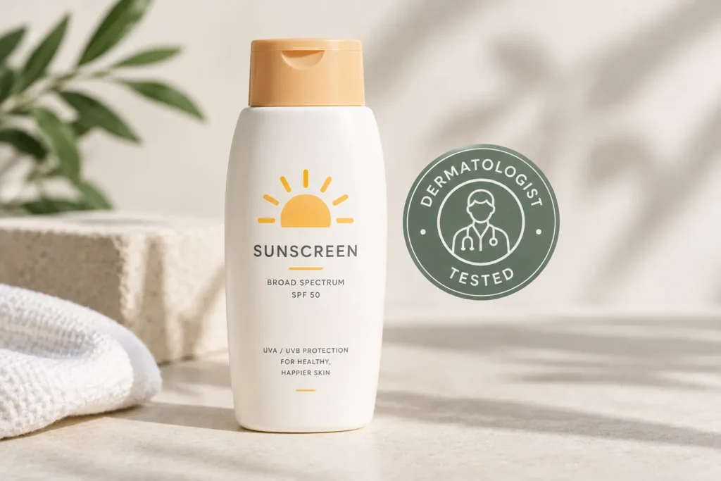
10. Pair the Product With a Small Trust Signal
A short, specific trust signal placed near the product, like a dermatologist tested label, a fragrance free callout, or a simple line about reef safe ingredients, does more work than a long list of claims. People skim ads quickly, so one clear signal that matches what they already care about is more persuasive than five vague ones competing for attention. A brand targeting sensitive or acne prone skin should choose the one trust signal that matters most to that specific customer rather than trying to fit them all in.
[INTERNAL LINK OPPORTUNITY: sunscreen packaging design ideas] [INTERNAL LINK OPPORTUNITY: mineral sunscreen benefits]
Final Thoughts
Standing out in a sea of sunscreen ads does not require a bigger budget, it requires a sharper idea. Whether you are building a campaign for your own brand or just gathering inspiration for a mood board, the ads that work best are the ones that feel specific, honest, and a little unexpected. Pick one idea from this list and try mocking it up this week before moving on to the next. Save this article so you have the full list ready whenever you need fresh inspiration again.
Image Alt Text Suggestions
- Before and after macro photo comparing sun damaged skin texture to smooth protected skin
- Sunscreen bottle on a bold coral background minimal ad design
- Hand applying sunscreen to bare shoulders outdoors sunscreen ad concept
- Illustrated sun character wearing sunglasses deflecting rays sunscreen ad idea
- Real skin texture photo of person applying sunscreen natural beauty ad
- Flat lay of sunscreen bottle with zinc oxide ingredient icon and benefit label
- Parent applying sunscreen to child’s arm at outdoor sports field
- Split screen sunny and cloudy sky graphic with UV ray icon sunscreen education ad
- Sunscreen blending into skin sequence showing white cast to invisible finish
- Sunscreen bottle with dermatologist tested badge trust signal ad design
FAQ Section
What makes a sunscreen ad actually effective? An effective sunscreen ad shows a clear benefit fast, usually through a visual, and pairs it with one honest trust signal. Ads that overload the viewer with claims or generic beach imagery tend to get scrolled past.
Should sunscreen ads use models or real customers? Both can work, but ads featuring real, unedited skin texture often build more trust because they feel less staged. A mix of both across a campaign usually performs better than relying on one style alone.
How important is color in sunscreen ad design? Color plays a bigger role than most brands realize. A bold, distinct color palette helps an ad get noticed and remembered, especially when most competitors default to the same beachy yellows and blues.
What is the biggest mistake brands make in sunscreen advertising? Leaning too heavily on fear based messaging or generic lifestyle photos is the most common mistake. It makes ads blend together instead of standing out.
Can humor work in sunscreen marketing? Yes, especially on social platforms where people are scrolling for entertainment. A lighter, playful tone can make a brand feel more approachable, as long as the core message about protection still comes through clearly.
Do sunscreen ads need to mention ingredients? Not always, but highlighting one key ingredient can build credibility quickly with skin care shoppers who read labels closely. It works best when kept short and specific rather than turned into a long ingredient lecture.


