
10 Sunscreen Cream Advertisement Ideas That Get Clicks
If you have ever poured money into a sunscreen ad only to watch it flop, you already know the frustration. The product is good. The formula works. But the ad just sits there, ignored, while a competitor’s post gets thousands of saves. You are not doing anything wrong as a person, you just have not found the angle yet. This article walks you through 10 sunscreen cream advertisement ideas that are proven to catch attention and actually earn clicks, not just impressions.
1. Show the “Before the Burn” Moment
Most sunscreen ads jump straight to the product bottle, which is exactly why people scroll past them. Instead, open with the moment right before sun damage happens: a woman heading out the door, a kid running to the pool, a picnic in full sun. This creates a small tension the viewer wants resolved, and your product becomes the answer instead of just another item on a shelf.
A common mistake here is showing damaged, sunburned skin as the hook. It feels harsh and people scroll away out of discomfort. Fix this by keeping the “before” moment light and relatable instead of alarming.

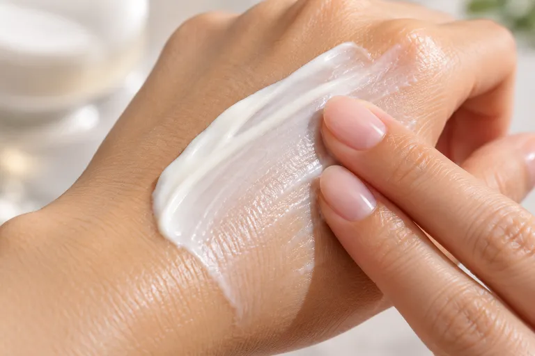
2. Use a Texture Close Up
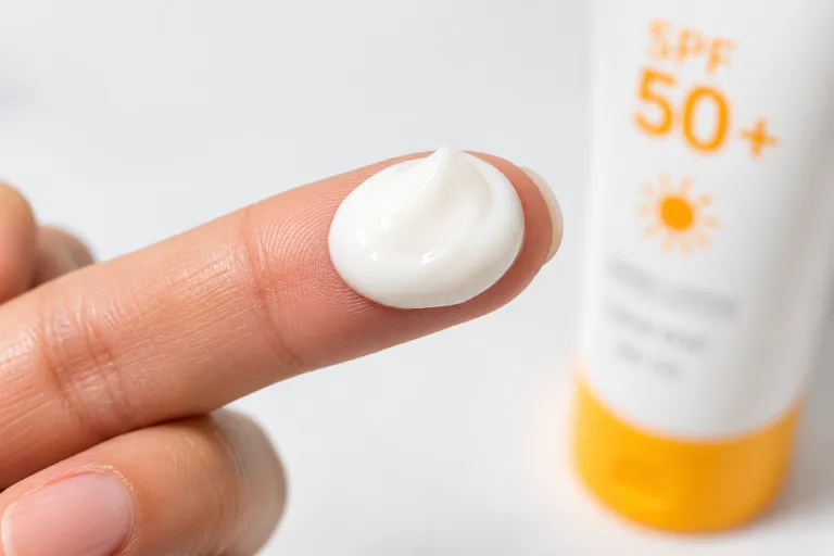
People buy sunscreen based on how it feels almost as much as how well it protects. A close up shot of the cream blending into skin, showing whether it is matte, dewy, or lightweight, tells a story words cannot.
This works especially well for brands targeting people with oily or acne prone skin, since “will this feel greasy” is one of the biggest hesitations before buying. A slow motion clip of the cream melting in gives instant reassurance.
3. Compare Old Sunscreen vs New Formula
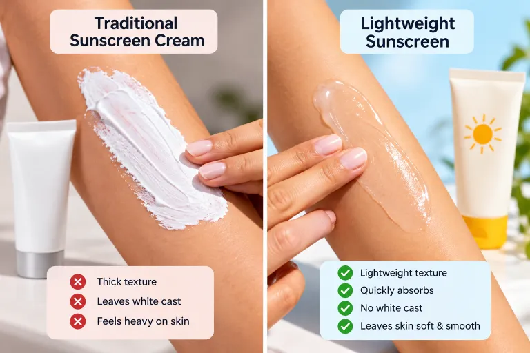
Curiosity moment: a lot of people still think all sunscreen leaves a white cast, because that is what they grew up using. A simple side by side, old chalky sunscreen versus your lightweight formula, breaks that assumption fast.
This idea works best for reformulated or newly launched products where the improvement is the actual selling point. Keep the comparison visual, not just a claim in text, since seeing is what convinces people here.
4. Lead With a Real Customer Reaction
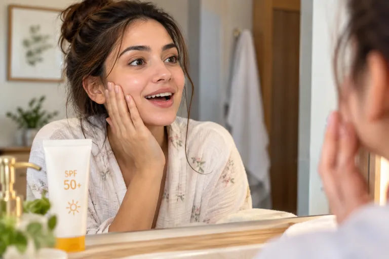
Nothing sells faster than someone else’s honest surprise. A short clip or quote from a real customer saying something like “I did not expect this to actually absorb this fast” feels more trustworthy than any brand claim.
This is especially save worthy content for people who are on the fence, since seeing a stranger’s genuine reaction lowers the risk of trying something new. Just make sure the reaction sounds natural, not scripted, or it loses its power completely.
5. Tie It to a Daily Routine, Not Just Summer
A common mistake brands make is only advertising sunscreen in summer, then going quiet the rest of the year. But UV damage happens year round, even on cloudy days and through windows.
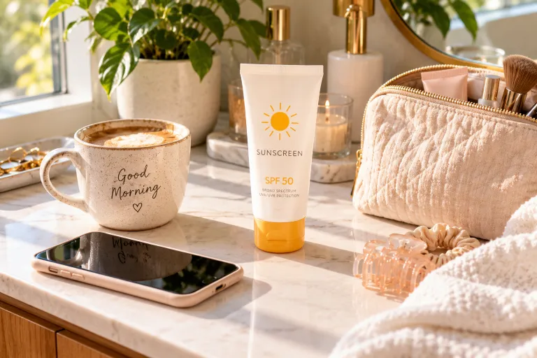
Show the product sitting next to a morning coffee, a makeup bag, or a work desk to frame it as a daily habit rather than a seasonal purchase. This use case framing helps the ad perform in fall and winter too, when competition for attention is lower and ad costs are usually cheaper.
6. Highlight One Specific Ingredient
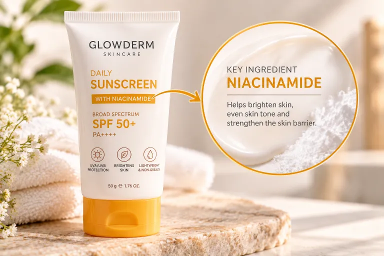
Vague claims like “protects your skin” get scrolled past because everyone says that. Naming one specific ingredient, like niacinamide, zinc oxide, or vitamin E, and explaining in one sentence what it actually does, gives the ad real credibility.
This works because it shows you understand the product at a deeper level, not just the marketing copy. Pick the one ingredient your audience already searches for or asks about most, and build the whole ad around that single detail instead of listing everything at once.
7. Show It Working Under Makeup
One of the biggest hesitations people have about sunscreen is whether it will pill up or ruin their makeup. An ad that shows the cream applied first, then makeup going on smoothly over it, directly answers a question your audience is already asking.
This idea is a strong fit for anyone marketing to people aged 25 to 45 who wear makeup daily and need SPF that fits into that routine, not one that fights against it. A simple two step clip works better here than a long explanation.

8. Use a “Mistake People Make” Angle
Most people apply far less sunscreen than the recommended amount, and most do not know that. An ad built around this one overlooked fact, followed by a quick fix, naturally pulls people in because it feels like useful information, not just a sales pitch.
This mistake plus fix pattern works well as a short caption paired with a simple visual of the correct amount to use. It also builds trust, since you are teaching something true instead of only pushing a purchase.
9. Feature a Relatable Location, Not a Studio
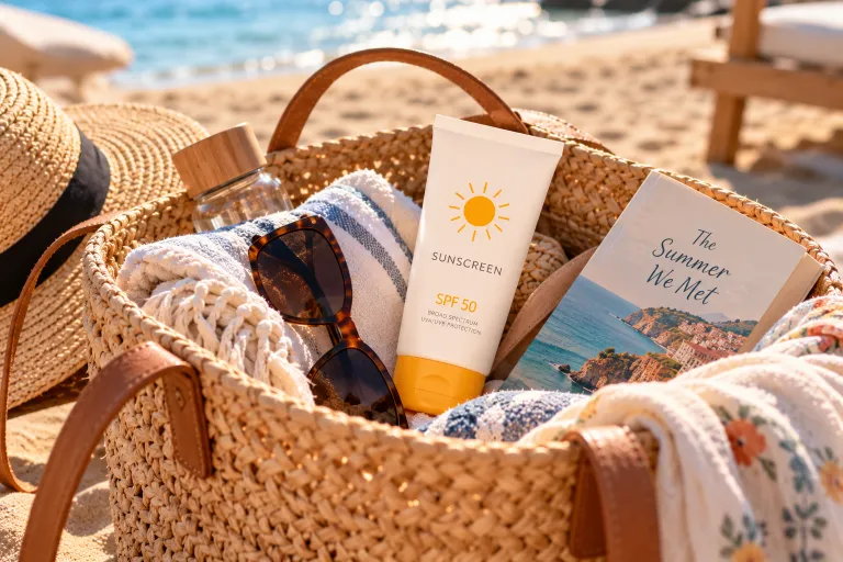
A sunscreen ad shot in a plain white studio rarely feels real. Filming or photographing the product somewhere relatable, a car on the way to work, a beach bag, a backpack for a hike, helps the viewer picture themselves actually using it.
This is a small detail, but it matters because people trust context more than a polished, staged shot. Match the location to where your specific audience actually spends time outdoors for the strongest connection.
10. End With a Simple, Specific Offer
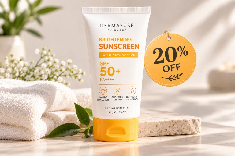
A surprising number of sunscreen ads get someone interested and then give them nowhere clear to go. A specific, low pressure offer, like a small discount on a first order or a free sample size, gives hesitant buyers a reason to act now instead of scrolling on and forgetting.
Keep the offer simple and easy to understand in a few words. A complicated deal with too many conditions tends to lose people right at the moment they were ready to click.
If you have been feeling stuck watching your sunscreen ads underperform, it is not because your product is not good enough. It is usually because the ad is not showing the right moment, the right detail, or the right reason to trust it. Pick one or two of these ideas and test them this week instead of trying to overhaul your whole strategy at once. Small, specific changes are usually what turn a scroll past into an actual click. Save this list so you have it ready the next time you are planning a campaign.
Image Alt Text Suggestions
- Woman applying sunscreen at her front door before heading outside on a sunny day
- Close up of lightweight sunscreen cream blending into skin
- Side by side comparison of thick white sunscreen and a clear lightweight formula
- Customer applying sunscreen with a surprised, happy reaction
- Sunscreen bottle on a bathroom counter as part of a daily morning routine
- Sunscreen bottle with a graphic highlighting one key active ingredient
- Sunscreen being applied followed by makeup going on smoothly without pilling
- Coin sized amount of sunscreen shown on a fingertip for correct application
- Sunscreen bottle inside an open beach bag with sunglasses and a towel
- Sunscreen bottle displayed next to a simple discount offer graphic
FAQ Section
Q: What makes a sunscreen advertisement actually get clicks instead of being scrolled past?
Ads that show a specific, relatable moment, like a texture close up or a real customer reaction, tend to outperform generic claims. Specificity is what stops the scroll.
Q: Should sunscreen ads only run in summer?
No, UV exposure happens year round, so ads framed around a daily routine rather than a season tend to perform better and often cost less to run in off peak months.
Q: What is the biggest mistake brands make in sunscreen ads?
Leading with a plain product shot instead of a relatable moment or problem. Viewers need a reason to keep watching before they see the bottle.
Q: How important is showing sunscreen under makeup in an ad?
Very important for audiences aged 25 to 45, since pilling under makeup is one of the top reasons people avoid trying a new sunscreen.
Q: Do customer testimonials really improve ad performance?
Yes, genuine, unscripted reactions build trust faster than brand made claims, especially for skincare products where people are cautious about trying something new.
Q: What kind of offer works best at the end of a sunscreen ad?
A simple, low pressure offer like a small discount or free sample size tends to convert better than a complicated deal with multiple conditions.
Want this as a downloadable file too?


