
11 Sunscreen Packaging Design Ideas for Modern Brands
If you have ever stood in the sunscreen aisle staring at ten different bottles that all look the same, you know how easy it is to blend in instead of stand out. Packaging is often the very first thing a customer notices, long before they read a single ingredient. For a small or growing skin care brand, that first impression can decide whether someone picks up the bottle or walks right past it. The good news is that great sunscreen packaging design does not require a huge budget or a design degree. It just takes a clear idea of what feels modern, trustworthy, and easy to use. Here are 11 sunscreen packaging design ideas that are helping brands catch the eye in 2026, both on the shelf and on Pinterest.
1. Matte Finish Tubes With Minimal Text
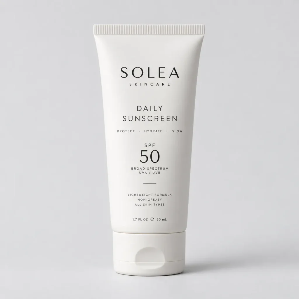
A matte finish instantly makes a bottle feel more premium, even if the formula inside costs the same as a glossy competitor. The trick is to pair that matte texture with very little text on the front label. Most shoppers only need three things at a glance: the brand name, the SPF number, and one short benefit like “lightweight” or “reef safe.” Everything else can move to the back or the side of the tube.
A common mistake here is trying to fit too much information on the front, which makes the design feel cluttered instead of clean. The fix is simple. Pick one message and let the matte texture do the rest of the talking. This look works especially well for smaller, budget-conscious brands because matte lamination is not much more expensive than gloss, but it reads as far more expensive to the customer.
2. Ombre and Gradient Color Blends
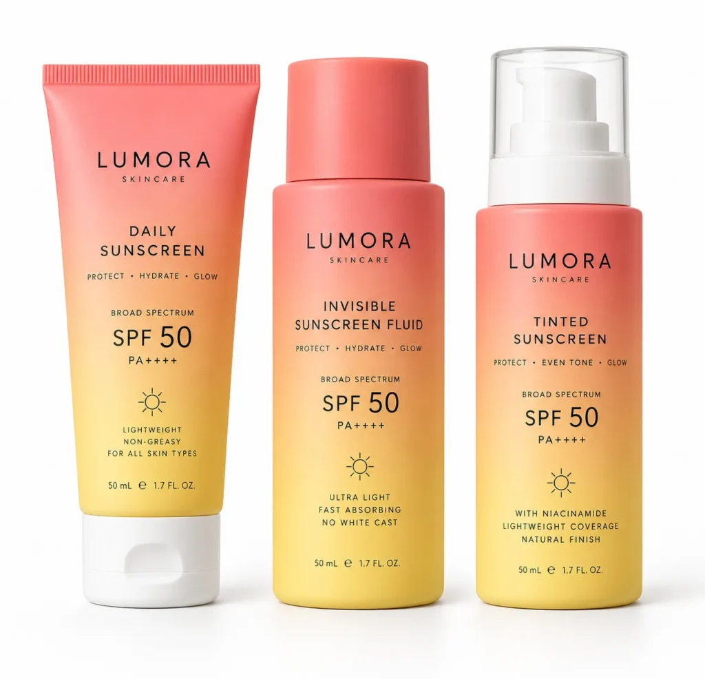
Soft gradients that shift from one shade into another, like a sunset moving from coral into soft yellow, give sunscreen packaging a warm, seasonal feeling without using a single photo. This style works especially well for brands that sell multiple SPF levels, since you can use a slightly different gradient for each strength while keeping the overall look connected.
The gradient does more than decorate the bottle. It quietly tells a story about warmth and sun without needing a beach photo, which keeps the packaging feeling fresh instead of like every other sunscreen on the shelf. Keep the gradient soft rather than saturated so the label still feels calm and skin friendly, not like a soda can.
[INTERNAL LINK OPPORTUNITY: Sunscreen aesthetic ideas for a cohesive beauty brand]
3. Recyclable and Refillable Packaging
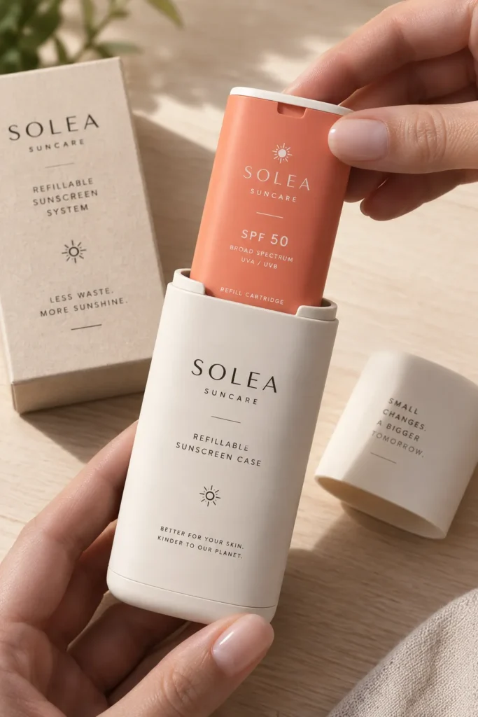
More shoppers now check the bottom of a bottle for a recycling symbol before they check the price. Building your packaging around a refillable system, where the customer keeps one outer case and only replaces an inner pouch or cartridge, is one of the strongest trust signals a modern sunscreen brand can offer.
This idea works best for mid-range and higher-end brands, since the refill system does require a slightly higher upfront investment in tooling. For smaller brands, even switching to a fully recyclable single material tube, instead of a mixed plastic and metal tube, is a meaningful and much more affordable first step. Either way, print the recycling instructions clearly on the packaging itself, not just on the website, since most people decide in the store.
4. Vintage Inspired Sun Care Labels
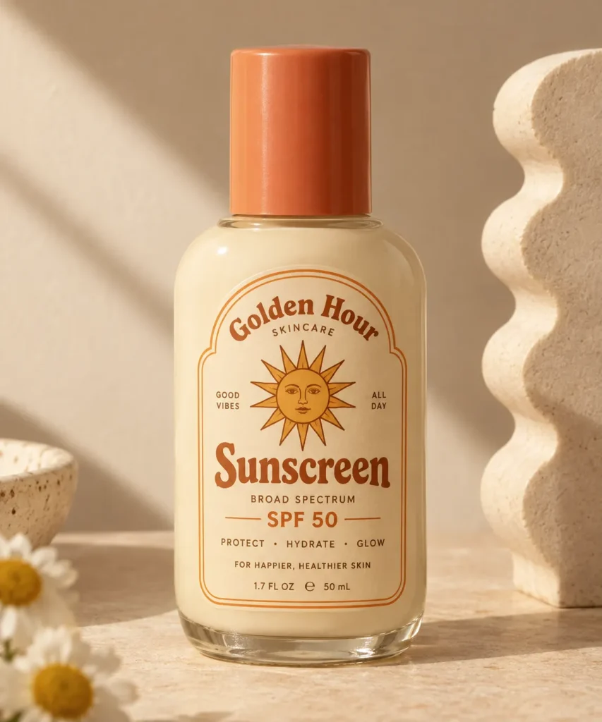
There is a growing wave of sunscreen brands leaning into a retro, 1970s beach club feeling, with rounded typography, warm cream backgrounds, and small illustrated suns or palm leaves. This style feels nostalgic and playful, which makes it stand out next to the clinical, all white bottles that dominate most drugstore shelves.
This works especially well for brands selling to a younger audience who shops with vacation and nostalgia in mind. A common mistake is going too far into costume territory with heavy distressed textures that make the label hard to read. Keep the vintage details light, a rounded font here, a small sun icon there, so the design still feels current rather than like a prop from a movie set.
5. Clear Glass With Visible Product
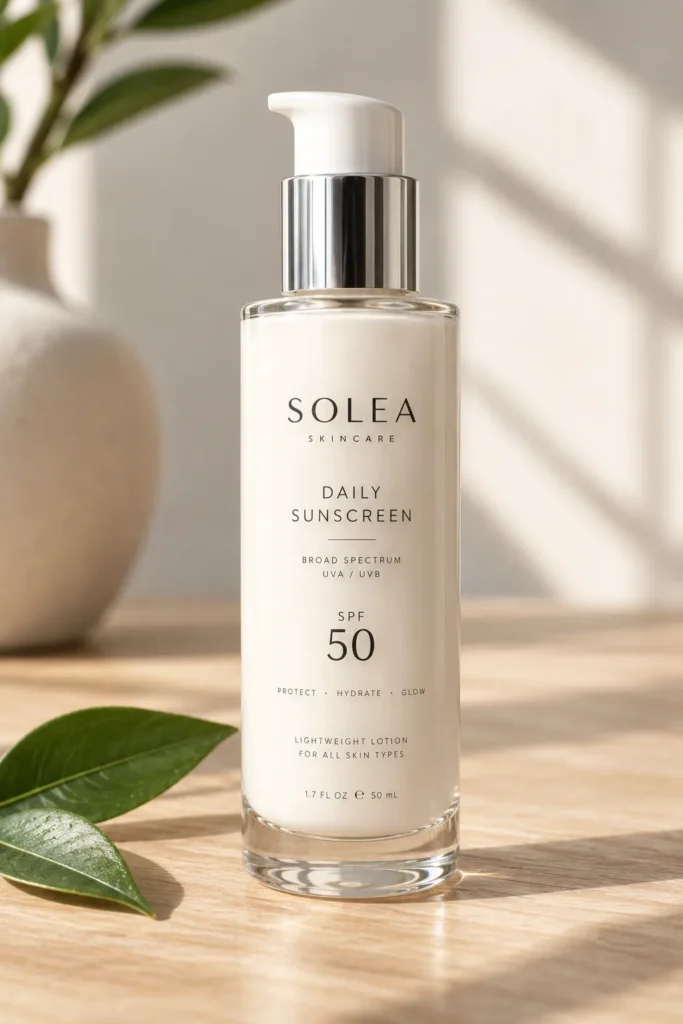
Letting the customer see the actual lotion or gel through a clear glass bottle builds a surprising amount of trust, especially for mineral sunscreens with a slightly tinted or whitish formula. It signals that the brand has nothing to hide.
The trade off is that clear glass needs a formula that looks appealing on its own, since any separation or discoloration will be visible right away. This idea works best for brands with a stable, well tested formula and a slightly higher price point, since glass also feels more luxurious in hand than plastic. Pair the clear glass with a simple pump top so the product still feels practical for daily use, not just decorative.
6. Bold Single Color Blocking
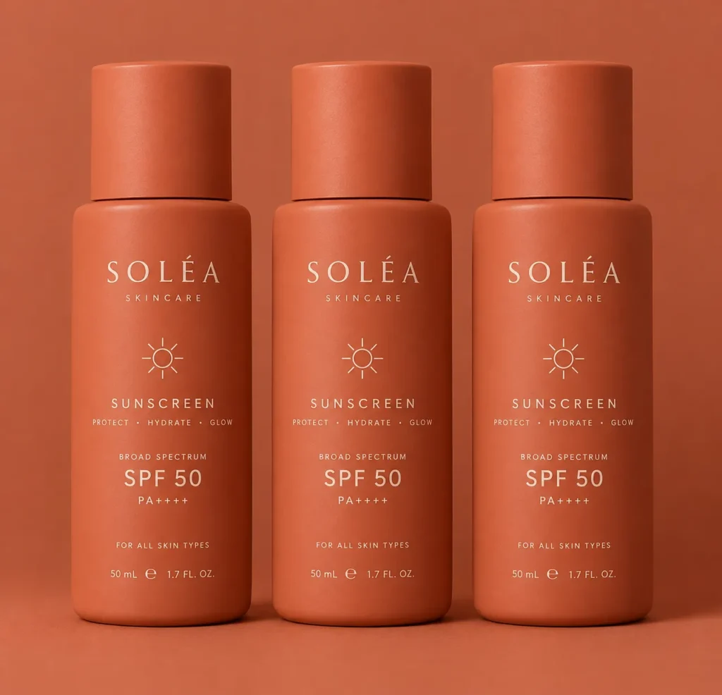
Instead of a busy label, some of the most memorable sunscreen brands now use one single, saturated color across the entire bottle, like a deep coral, a bright coconut white, or a soft terracotta. The brand name sits in one clean spot, often embossed or in a contrasting color, and that is the entire design.
This approach works because it is incredibly easy to recognize from across a store or a Pinterest feed. The challenge is picking a color that still feels appropriate for skin care, not overly industrial. Warm, sun inspired tones tend to work better than very dark or neon shades. If you sell more than one SPF level, use the same color family in slightly different shades so the whole line still feels connected on a shelf.
7. Illustrated Botanical Details
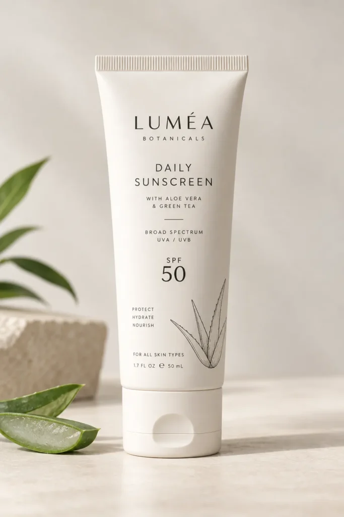
Small, hand drawn style illustrations of ingredients like aloe leaves, coconut, or green tea give a bottle a natural, artisanal feeling without needing an actual photo of the plant. These illustrations work best when they are simple line drawings in one or two colors, placed in a small corner of the label rather than covering the whole bottle.
A common mistake brands make here is using overly detailed, full color botanical illustrations that end up looking cluttered next to the ingredient list and SPF number. Keep the illustration small and let it act as a supporting detail, not the main focus. This style is a great fit for brands that genuinely lead with natural or plant based ingredients, since the packaging should always match what is actually inside.
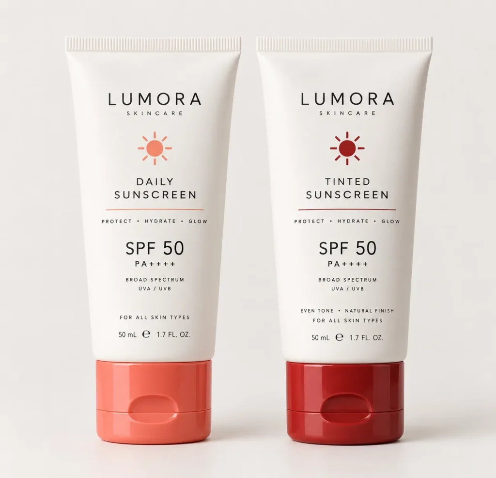
8. Two Tone Cap and Body Contrast
A simple but effective trick is designing the cap in a different color or finish than the body of the bottle. A matte white body with a glossy coral cap, for example, gives the packaging visual interest without adding any extra text or graphics.
This idea is worth saving because it is one of the easiest and cheapest upgrades a small brand can make. Most manufacturers can produce caps in a different color at little to no extra cost compared to matching caps. It also helps customers quickly tell different SPF levels apart if you assign a specific cap color to each strength, like a light cap for SPF 30 and a deeper shade for SPF 50.
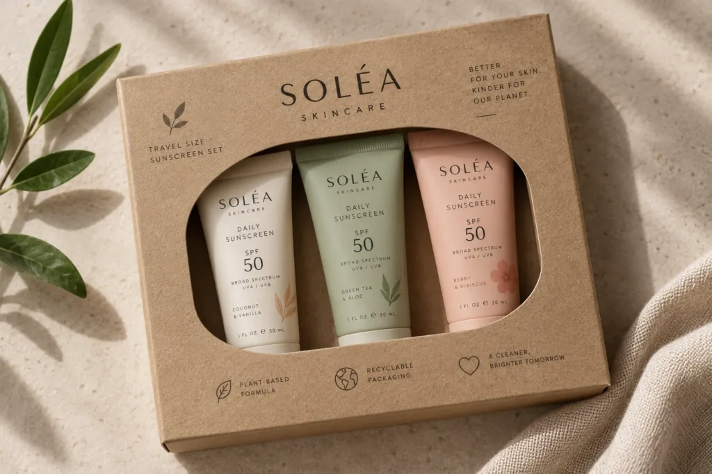
9. Travel Size Multi Packs With Clear Windows
For sunscreen specifically, travel size packaging deserves its own design thinking, since so many customers buy these for beach bags, gym bags, or carry ons. A small window cut into the box, showing the actual bottle inside, helps reassure shoppers about size and color before they buy, which matters a lot for smaller products where the packaging can otherwise feel misleading.
This works especially well when sold as a multi pack, like three travel tubes bundled together in one recyclable cardboard sleeve with a die cut window. It gives the customer confidence about what they are getting and makes the product feel practical rather than like an afterthought version of the full size bottle.
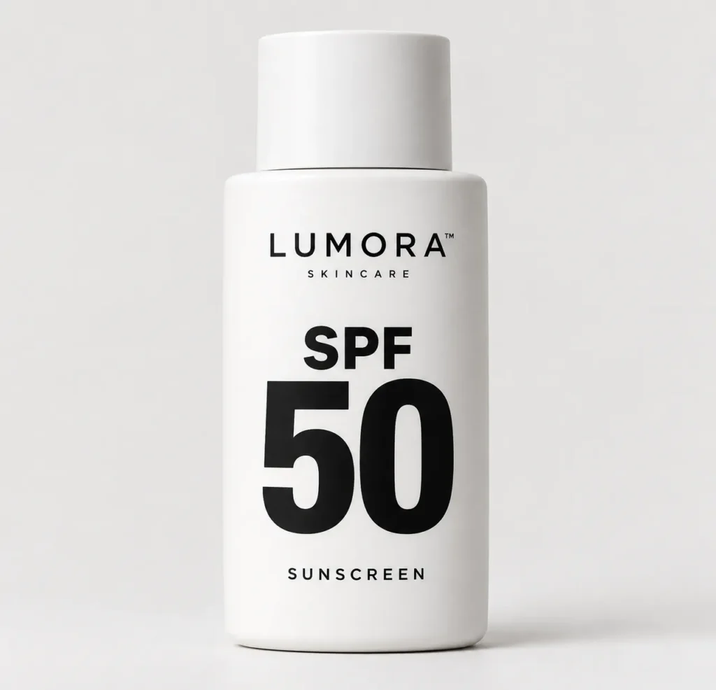
10. Typography Led Minimalist Design
Some of the most talked about sunscreen brands right now use almost no imagery at all. Instead, the entire design is built around one strong, well chosen font, often in a slightly oversized scale, with the SPF number as the largest element on the bottle.
This style takes real confidence to pull off, since there is nowhere to hide behind decoration. It works best when the brand name is short and easy to read at a glance. A common mistake is choosing a trendy font that is hard to read quickly, which defeats the purpose of a minimalist design. Test your typography by looking at the bottle from a few feet away. If you cannot read the SPF number instantly, the font needs to be simplified.
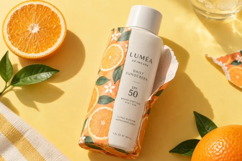
11. Seasonal Limited Edition Wraps
Adding a removable, seasonal outer wrap around a core bottle design lets a brand feel fresh throughout the year without redesigning the entire product line. A summer wrap might use bright citrus tones, while a spring version leans into softer pastels.
This is a smart option to keep in your back pocket for later, since it lets you test new looks and create a sense of limited availability without the cost of new bottle molds or full packaging redesigns. It also gives customers on Pinterest and social media a reason to keep checking back for what is coming next. Just make sure the core bottle underneath still looks complete and intentional on its own, in case the wrap gets removed or damaged before purchase.
[INTERNAL LINK OPPORTUNITY: Sunscreen ads and campaign ideas beauty brands are using this year]
Final Thoughts
Good sunscreen packaging design does not need to shout to be noticed. It needs to feel intentional, honest about what is inside, and easy to recognize at a glance, whether someone is standing in a store aisle or scrolling through Pinterest late at night. Pick one or two ideas from this list that fit your brand’s personality rather than trying to do everything at once. Save this list and come back to it the next time you are ready to refresh your packaging, even if that is not until next season.
Image Alt Text Suggestions
- Matte white sunscreen tube with minimalist black text label
- Sunscreen bottles with soft coral to yellow ombre gradient design
- Refillable sunscreen case with cartridge insert for eco friendly packaging
- Vintage style sunscreen bottle with retro sun illustration and rounded font
- Clear glass sunscreen bottle with pump top showing lotion inside
- Bold terracotta color block sunscreen bottles in a row
- Sunscreen tube with small line drawn aloe leaf illustration
- White sunscreen tube with contrasting coral cap design
- Travel size sunscreen multi pack with die cut window box
- Minimalist typography sunscreen bottle with large SPF number
- Sunscreen bottle with removable citrus colored seasonal wrap
FAQ Section
What makes sunscreen packaging design different from other skin care packaging? Sunscreen packaging needs to clearly communicate SPF level and protection type at a glance, since customers often compare several bottles quickly in store. It also tends to need slightly sturdier materials since sunscreen is used outdoors, in bags, and around sand and water more than most other skin care products.
Is matte or glossy packaging better for sunscreen brands? Matte finishes tend to read as more premium and modern, while glossy finishes feel brighter and more playful. Neither is objectively better, so the right choice depends on whether your brand feels more minimalist or more fun and beach inspired.
How much does custom sunscreen packaging design typically cost for a small brand? Costs vary a lot depending on materials and order size, but simple upgrades like a two tone cap or a new label design are usually far more affordable than switching to custom bottle molds or refillable systems. Many small brands start with label and color changes before investing in structural packaging changes.
Does eco friendly sunscreen packaging cost more than standard plastic packaging? It can, especially for refillable systems or glass, but fully recyclable single material plastic is often close in cost to standard packaging. Many brands treat sustainable packaging as a gradual upgrade rather than an all at once switch.
How do I choose a packaging style that still looks good as a Pinterest pin? Look for designs with strong color contrast and a clear focal point, since busy or overly detailed labels can look cluttered in a small pin preview. Simple, bold packaging tends to perform better visually when it is scaled down for a phone screen.
Should every SPF level in my line look identical or slightly different? A shared design with one changing detail, like cap color or a small number badge, tends to work best. It keeps the whole line recognizable as one brand while still helping customers quickly tell the different SPF strengths apart.


